AFS Analytics Dashboard Guide
The dashboard lets you view all the website analytics and statistics. Updated in real-time, the dashboard can be customized at your convenience: How to customize the dashboard and the widgets?
Setting the report date range
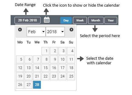
The calendar lets you define the report date. You can select or change the date range by selecting a period: Day, Week, Month or Year. Click on the calendar icon to show or hide the entire calendar.
The Charts section
The gauges
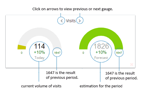
The gauges measure your traffic for the defined period. You can select the measure units: visits, pages view or unique visitors.
The percentage gives you the comparison with the previous period. The red color shows an inferior performance, green color a better performance and yellow color an equal performance
First Gauge
The first gauge shows the number of the current visits, P.V. or unique visitors for the defined period.
Second Gauge (Estimate)
The second gauge indicates the number of visits, page views, or unique visitors your might get on your site for the entire period. It is an estimate according to the visits, page views and unique visitors received since the beginning of the period.
The main chart
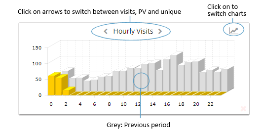
The main chart shows the detail of the visits, P.V., or visitors. You can switch between line and 3D charts by clicking on the chart icon.
You can hover your mouse cursor over the chart dots or columns to see more details.
You can zoom the chart by selecting an area with your mouse. Click on the chart, hold the button down and move the cursor to select the area to expand the view.
Colors:
The Donut chart
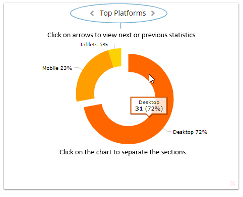
This is a rolling chart. You can see the following reports: Top platforms, Top sources, new vs returning visitors, Top search engines. You can move your mouse on the chart to see detail. Click on the chart to separate the different sections.
The Widgets Manager.
The Widgets Manager allows you to add and remove Widgets. You can set your Dashboard preferences and restore the original layout and widgets.
Open the Widgets Manager.
The Widgets Manager appears when you click on the wrench icon located next to the date.
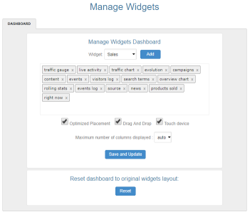
Add Widgets to your Dashboard.
Select a Widget from the drop-down menu and click on the add button. The Widget will be added to the Widgets list.
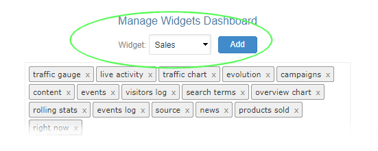
Delete Widget from your Dashboard.
Just click on the Widget name inside the Widgets list. The Widget will be removed from the list.

Note: Once your work is finished, make sure to save your changes by clicking on the “Save and Update” button. 
Widget toolbar
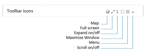
A toolbar is available for each window. It allows you to:
The dashboard size
The dashboard is divided into columns and rows.
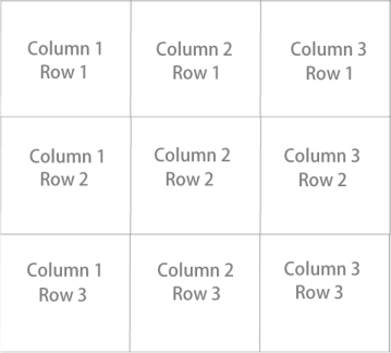
The number of rows is automatically defined according to the total vertical space occupied by the widgets.The number of columns is defined by the size of your screen: "auto" mode.
Resize a widget.
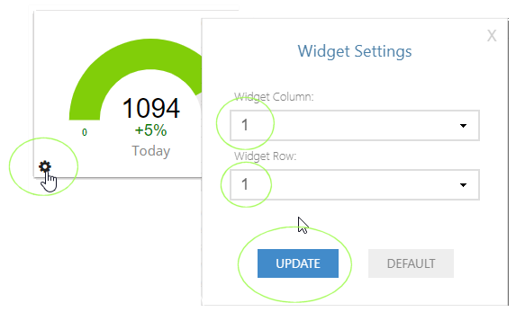
In the bottom right corner of each widget is displayed a gray icon. By clicking on it, a window appears with its settings.
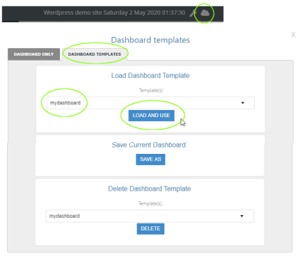
Loading a Dashboard template.
Loading a private or public dashboard template from the library.
Next step
Please read: Customize Dashboards and Manage WidgetsBy AFS Analytics, Saturday, May 2, 2020


